Digital accessibility has gone from being a niche specialty to a core requirement for interactive designers. So while we can all agree that’s a great thing for users, it can be overwhelming if you’re unfamiliar with the territory.
Wait, isn’t this a developer problem?
Accessibility isn’t a coat of paint that’s applied at the end of a project, it needs to be considered from the outset. We consider the usability of our projects all the time. We wouldn’t design a single desktop page comp, then hand it off to development to figure out the gaps, now would we?
Of course not! We design multiple states, obsess over multiple user flows, and sweat the interactive details. And it should be no different with accessibility! As designers, it’s our responsibility to consider how everyone will use the site.
Ok, where do I start?
When most people think about accessibility, they think about blind users navigating with a screen reader. So while it’s an important consideration, it’s one that might make designers believe they are off the hook. After all, a blind person can’t see what we make anyway, right?
Wrong. For starters, blindness isn’t binary; there can be degrees of sight. However, instead of just equating accessibility with screen readers, let’s start to think about designing inclusively.
The web is accessible by default, we just break it. - Seda Maurer
Inclusive design may sound like the buzzword du jour, but if we want to understand our users, we need to know that our audiences are made up of people of varying abilities. By designing a product that can be used by anyone, we can make one that’s better for everyone.
Solve for one, extend to all
Designing for people with disabilities can seem like a significant constraint, but the final product can benefit a much larger number of people.
Microsoft’s inclusive design toolkit has an excellent methodology for designing for everyone. By categorizing situations by Permanent, Temporary, and Situational, we can see how designing for a traditional “edge case” like a deaf user can extend to someone who only has temporary hearing loss from an ear infection to a bartender who can’t hear above the noise of a crowded pub.
Now to applying that to a website, we could include captions or transcripts of videos. Captioning allows a deaf user to understand the content of that video. Our ear infection patient on sick leave can lay in bed scrolling through social media, and still be able to understand video content. And while our bartender is probably not scrolling through Facebook videos behind the bar of a Saturday night rush, an office worker in a hushed environment might kill some spare time doing so with their phone in silent mode.
These are the kinds of situations we think of during persona exercises, and extending our empathy to disabled users should be our goal.
The Nuts and Bolts of Accessible Design
Now that we’ve made a case for designing inclusively, how do we put those principles into practice? By implementing a few of what's known as “the low-hanging fruit” of accessible design, you can improve your next web project. These affect our approach to color, typography, and content hierarchy.
Color
As designers, we pour over our palette choices – each hue backed up with a rationale. One extra step to take in this stage is to integrate color contrast checks into our palette to meet the Web Color Accessibility Guidelines acceptable contrast ratio.
A common misconception about accessibility is that meeting compliance requirements hinders creativity and beautiful design. However, good design has always been about creating within restraints.
I implement this by building out palette ranges and then creating common element patterns with different tones. Then they get run through a contrast checker to ensure a high enough ratio, along with previews of colorblind perceptions.
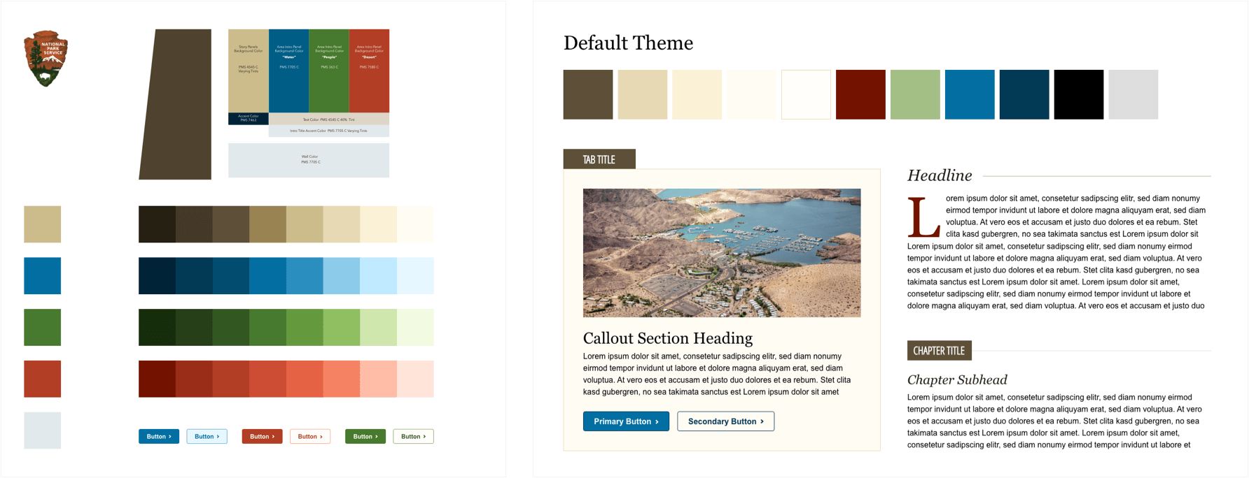
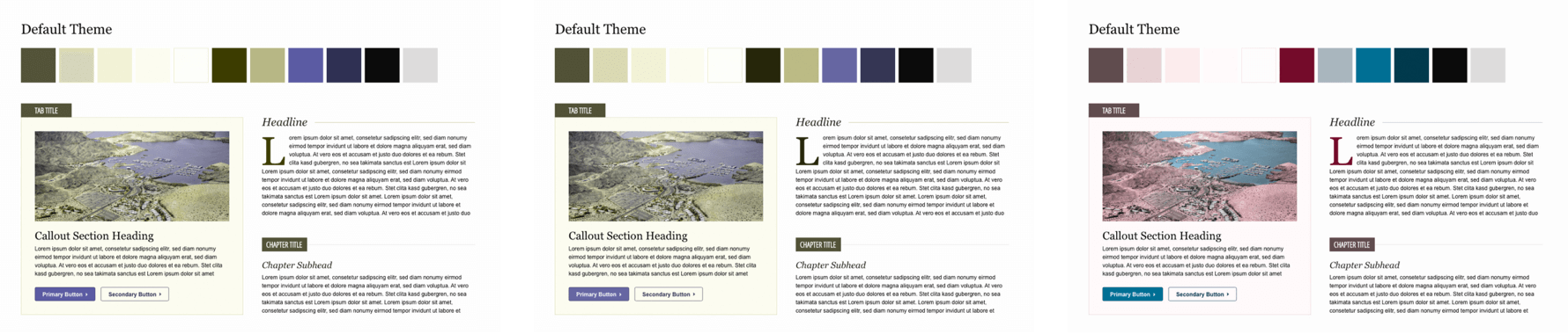
The Stark plugin (works with Sketch, Figma, and XD) is my primary tool of choice, but I also use the site Are My Colours Accessible along with the Color Oracle app for quick checks.
Again, we’re applying inclusive principles here. Contrast ratios aren’t just for the colorblind; anyone with low vision acuity would benefit as well. So would someone looking at their screen outside in the sun.
Also, make sure your interactive elements aren’t relying on color alone to convey changes. Best practices use a secondary notification as well, such as an icon, shape, or underline.
Color Recap:
Who you’ll help
- Colorblind users
- Users with low vision acuity
Ways to be Inclusive
- When building a brand palette, consider how these colors might be used on screens.
- Create a palette range and test how they can pair to create a high enough contrast ratio.
- Don’t rely on color-coding alone. Pair a link color to another visual, like underlines or arrows.
- Test with vision simulators.
Typography
Type is another design element where we love to sweat the details. While we often consider the brand and it’s target audience, we also mustn’t forget the basic rules of typographic legibility in the process.
Legibility can be affected by font choices, line lengths, justification, and content organization. This building block of good design can get abused easily, so it’s a good practice to consider how our typographic choices affect our users.
Choosing a typeface
Large san-serifs with plenty of leading tend to be easier for people to read, as are typefaces with higher x-heights. I also try to find fonts that have curved terminals, so it’s easier to tell the difference between 1, l, and I.
You’ll also want to use fonts as intended, which just means you shouldn’t use a display font for body copy. Often they have smaller x-heights and simply weren’t designed to be used for long-form.
Font-sizes
One of the trickiest things to let go is setting digital fonts in print sizes. But I want to encourage you to go big on font sizes. If you mostly deal with print type, the smallest font size you can use on screens (14px) is going to seem huge.
A good general rule is to keep body copy at the browser default of 1em (16px). But current best practices put the ideal body copy sizes in the 20-24px range.
Larger set type is easier to read from a distance, like say from your monitor to your office chair. It also improves readability when quickly scanning an article.
All of these things make your copy more legible for anyone with a level of eyesight deterioration. And makes life much easier for everyone else.
Line-length & spacing
Have you ever tried reading an article, but kept losing your place? It might have had a line-length that was too long. The longer your eye has to travel across a horizontal space, the more difficulty you’ll have in finding the next line down when you travel back to the start of the line.
According to The Elements of Typographic Style, the optimal number of characters in a line of text is between 55-75. Too long, and you’ll experience fatigue from scanning back and forth, and are more likely to lose your place. If it’s too short, and the content gets broken up too much.
So how do you determine an optimal line-length for your design? Any column width should be proportioned to the size of the type. Which means as we increase our copy size, so its container width should increase as well.
Paying attention to your leading (or line-spacing in CSS) will also make your content more readable. Broadly speaking, line-height should be at least 140% to 150% for body copy.
Justification
In the same way that line-length can affect readability, so too can the justification of a paragraph.
Center aligned text is pretty popular for introductory and email copy, and can be effective for short sentences, so long as they aren’t longer than 2-3 lines.
After that point, it becomes more challenging to read, since your eye never resets at the same spot with each line. The same is true of right-aligned text in languages that read left to right.
Left-aligned text in Western countries is the easiest to read since your eye always goes to the same starting point with each new line of text.
Justified content can also be a bit tricky since inconsistent gaps in copy can cause “rivers” of white space, which can create a distracting reading experience.
Copywriting
Now, you may be thinking, “Copywriting isn’t a design principle!”. However, I’d have to disagree. I tend to take a content-first approach to my web projects, and doing so gives me another opportunity to think about my designs inclusively.
One of the ways I like to layout a page is by starting with a rough draft of a narrative. I ask what the key points are of the story I’m trying to tell, and I base my layout off of a linear telling of that story.
This approach is one way I can avoid building markup that doesn’t make sense in order, even if it does visually. By focusing on the content early on, I can ensure the information isn’t confusing to someone listening with a screen reader.
Accessibility doesn’t hamper design.
Design has always been about solving problems within a set of constraints. Following these guidelines will allow you to create an accessible experience for everyone.
This article was originally written for the Braintrust blog.