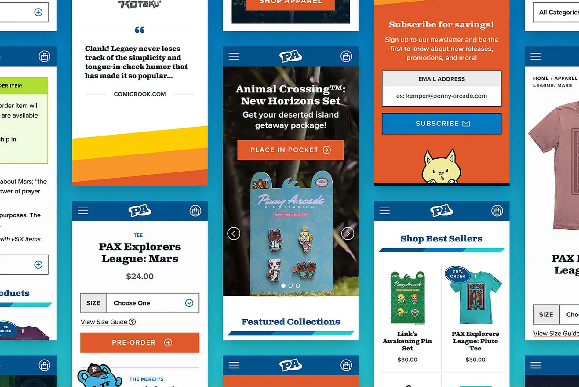
Bringing a beloved gaming brand's store into the modern web.

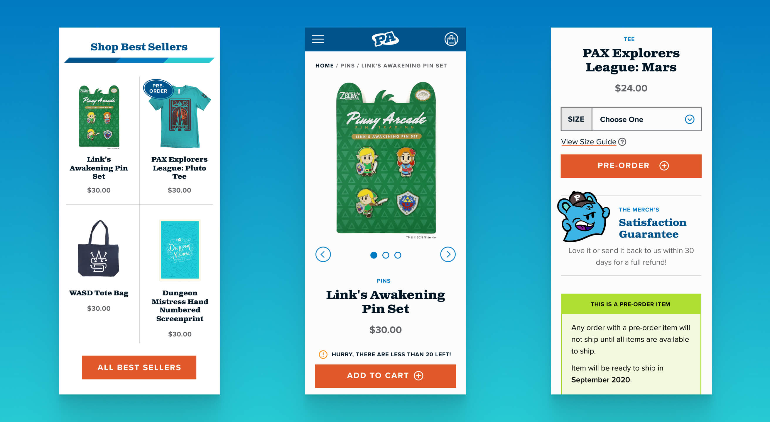
A collage of mobile screens showing the homepage, collection grid, and product page

Project Stats

  • client

    Penny Arcade
  • Type

    Ecommerce
  • role

    UX Design
    UI Design
    Art Direction
    Accessibility
  • industry

    Gaming & Pop Culture

the challenge

A community-first brand that had outgrown its own store.

Penny Arcade started as a webcomic, grew into PAX (one of the largest gaming conventions in the world), and eventually expanded into Acquisitions Incorporated, "Pinny Arcade", and licensed partnerships including Nintendo. All of that fed into a single Shopify storefront that hadn't kept pace with any of it.

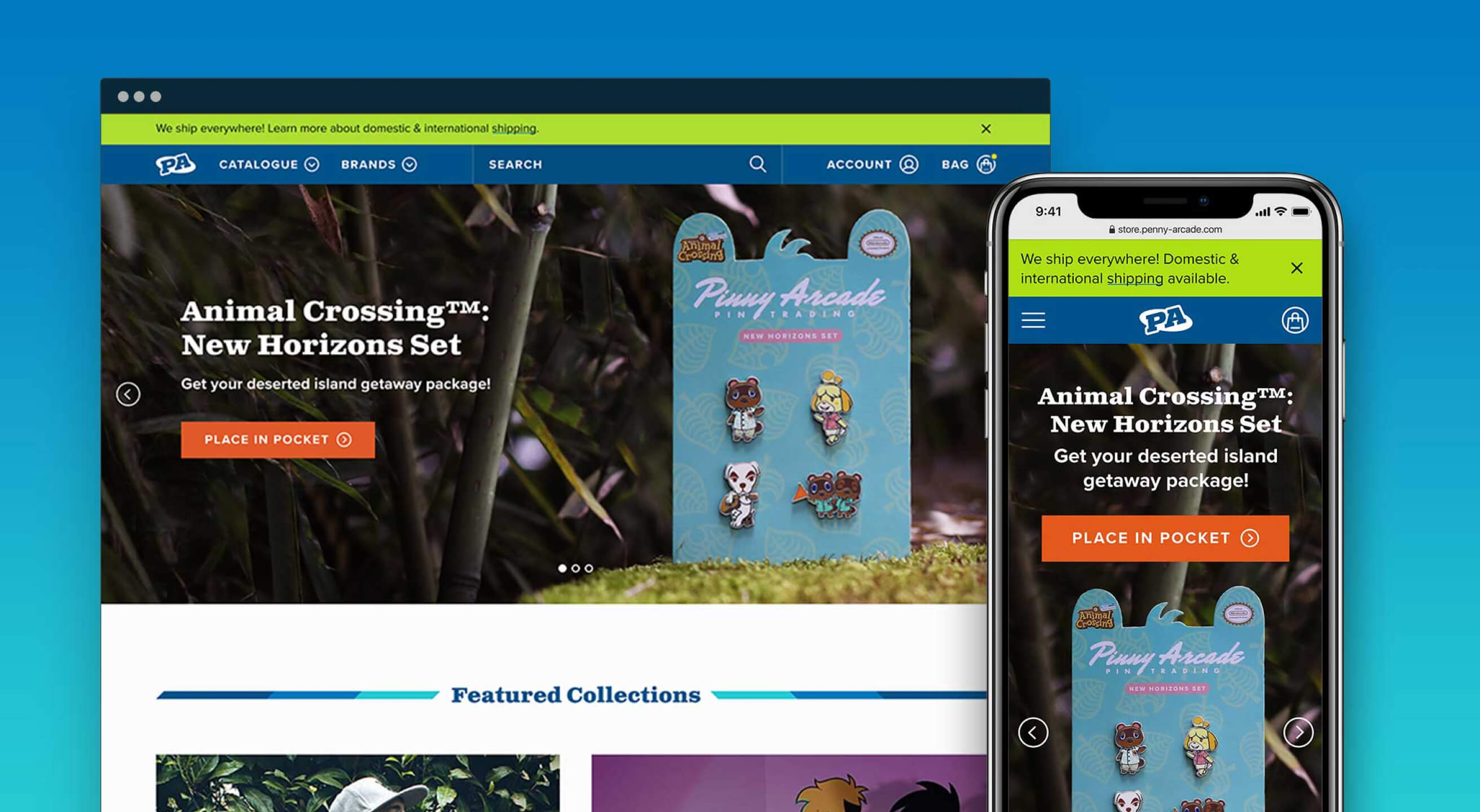
The site wasn't responsive, wasn't WCAG compliant, and checkout was genuinely hard to find. The catalog included apparel, pins, lifestyle goods, art, media, and PAX event product rotating in and out seasonally, but it had no organizing logic behind it. Fans who showed up looking for Acquisitions Incorporated merchandise or a specific Nintendo collab had no way to navigate directly to it.

The Approach

An accessibility-first color system.

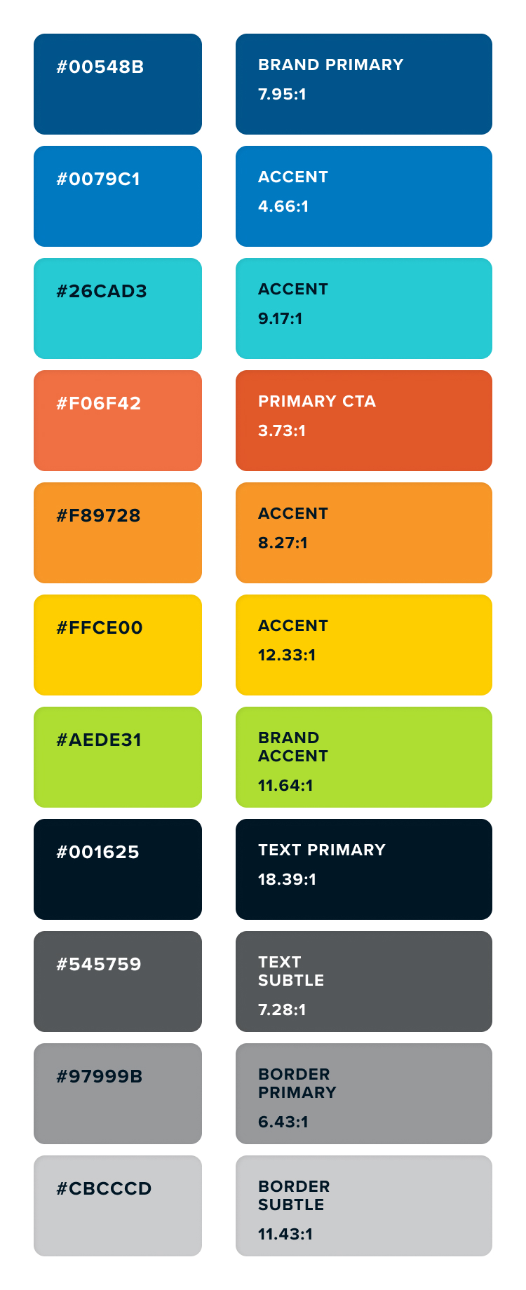
An accessible website starts in design. As part of the redesign, my task was to take the vibrant, energetic orange, navy, and teal palette and ensure it meet contrast requirements.

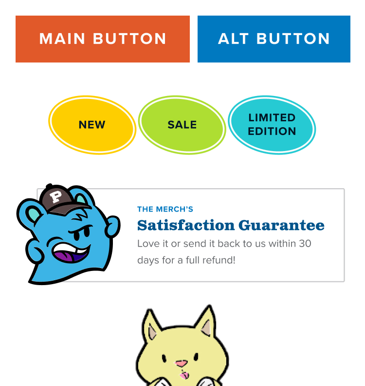
Orange and white is always a tricky balancing act for meeting contrast standards. White text is often too light, but switch to black and you either get a tonal vibration or it gives distinct Halloween vibes. By deepening the primary orange color and using it with only large text in white, we could ensure CTAs passed 3:1 for large text. The other vibrant colors could use dark text without the same issues that orange carries.

No items found.

Navigation built for a community rather than a product catalog.

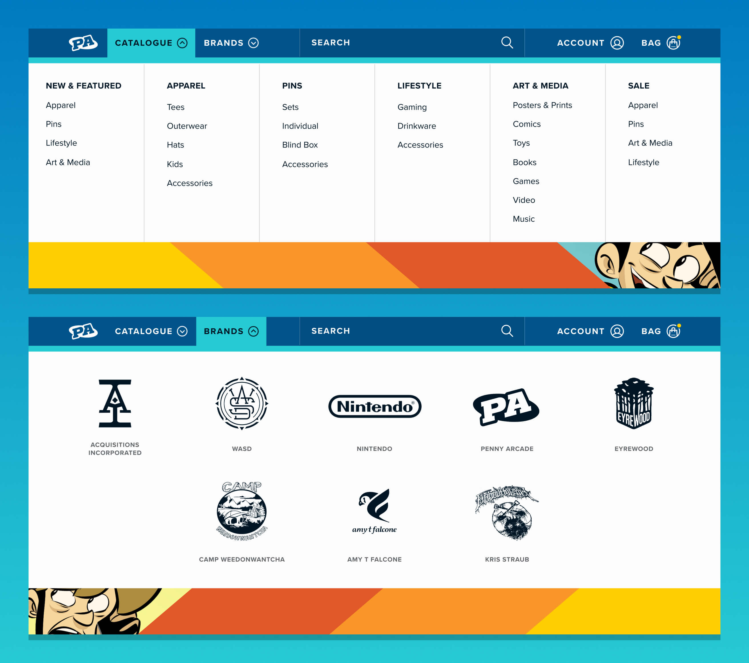
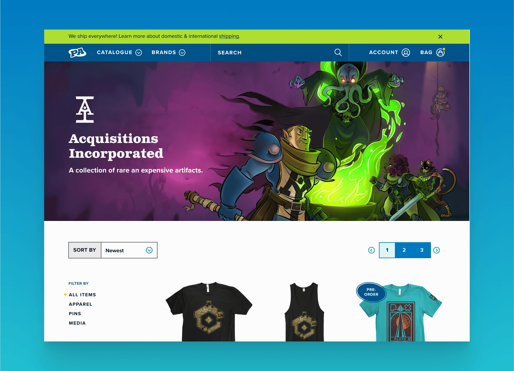
Penny Arcade's audience isn't monolithic. Fans show up for specific things: Acquisitions Incorporated, Pinny Arcade, the Nintendo collabs. The redesigned nav introduced two parallel discovery paths:

  • Catalogue for shoppers who know what product type they want.
  • Brands for fans navigating by IP.

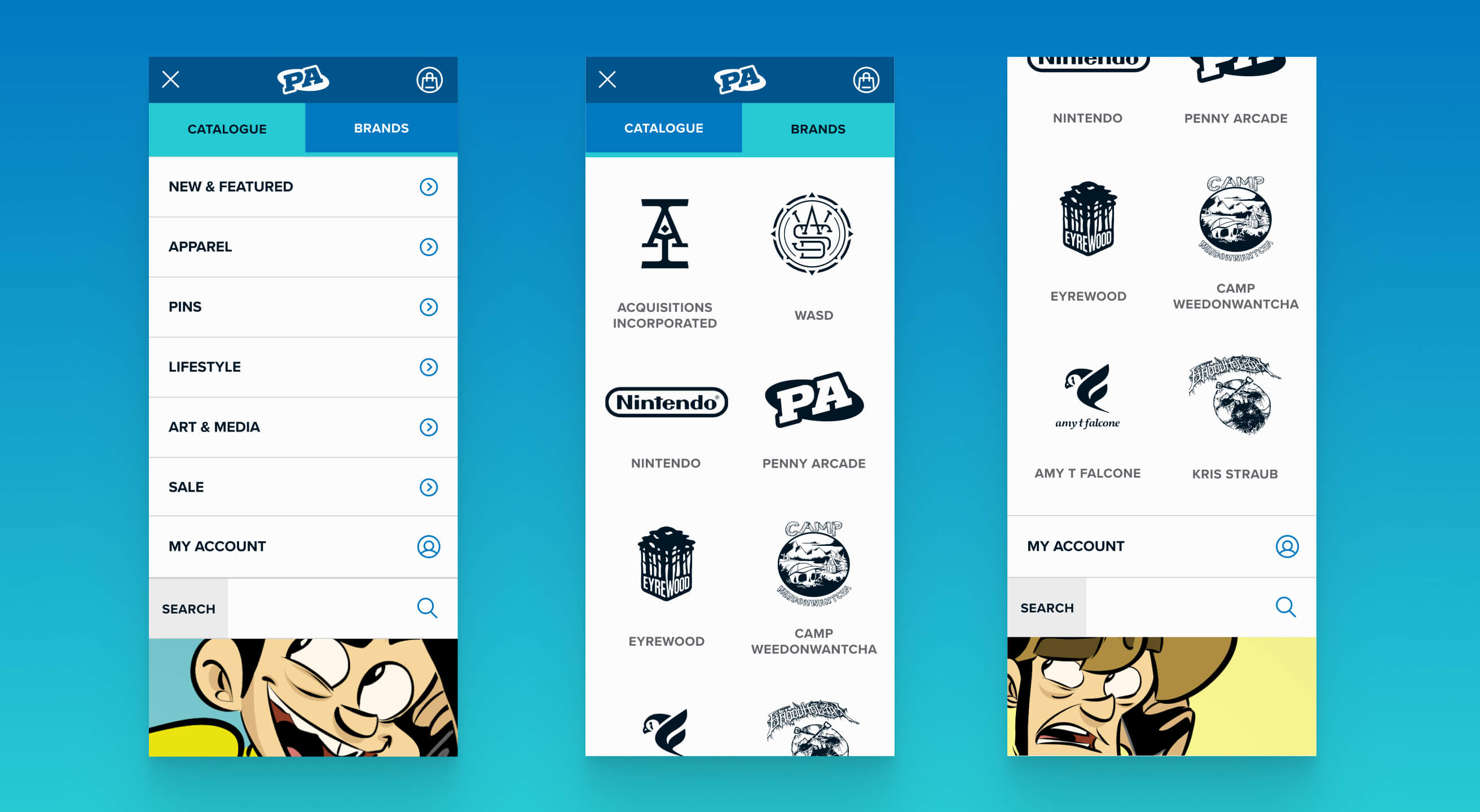
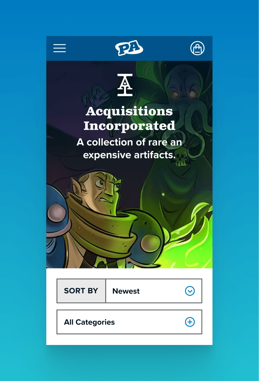
The Brands menu surfaces each as a logo so fans can find their corner by recognition rather than reading a list. Both paths open from the same header, keeping the structure clean without sacrificing depth.Mobile nav was built as a complete parallel system. The original site was effectively desktop-only, so there was no responsive pattern to extend.

A PDP system built for multiple purchase scenarios.

This template needed to be able to handle pre-orders tied to PAX event windows, scarcity-sensitive Pinny Arcade collectibles, licensed products with its own fulfillment constraints, sale items, and standard in-stock product.

The redesign created distinct CTA logic and messaging for each state: pre-order with a bold ship date and hold explanation, scarcity with a matter-of-fact urgency callout, out-of-stock with a back-in-stock notification instead of a dead end. A branded satisfaction guarantee module featuring the Merch mascot appears across all five states as a consistent trust anchor.

No items found.
No items found.

The impact

Updates for the modern web.

Mobile responsiveness, accessible color systems, brand-based navigation on a complex catalog, and a PDP system built for real purchase scenarios are consistently among the highest-impact issues in ecommerce UX research. Correcting them at the structural level tends to move conversion and retention metrics over time in ways that single-page optimizations don't.

No items found.