How a navigation and PDP overhaul drove an 87% conversion rate increase.

Homepage mockups for desktop and mobile breakpoints.

Project Stats

  • client

    Turbie Twist
  • Type

    Ecommerce
  • role

    UX Design
    UI Design
    Visual Design
  • industry

    Accessories

the challenge

A 25-year-old product was losing to its own knockoffs

The brand invented its category, but newer competitors had caught up on design while the site was still running on a homegrown build years past its prime.

  • Knockoffs were outranking the original in search, with no visual signal of who actually invented the product
  • Customers regularly bought the wrong material and expected the other, a costly mismatch on a low-price, high-volume product
  • A thousand-word product description buried the one distinction that actually mattered
  • Navigation had been bolted together over time, making it hard to find anything past the first product someone landed on
No items found.

The Approach

Building a navigation that scales with the catalog.

The site map consolidated five flat, growing menu items into a clear shop hierarchy, with bundles and rewards promoted to first-level navigation since they directly supported the brand's stated goals around AOV and retention. On mobile, the menu trigger moved from a dead corner to the top left, where the audit had flagged real user confusion, and the Shop dropdown was set to open on click rather than hover so keyboard and touch users got the same access as anyone using a mouse.

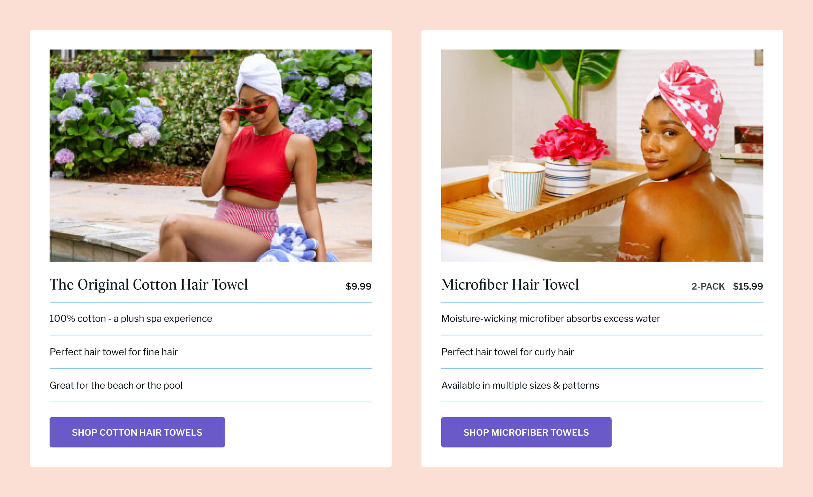
Solving the cotton vs. microfiber problem at every decision point.

Rather than trust customers to read a single paragraph and remember it, I built a comparison module that repeats wherever someone might be deciding between materials: the homepage, the collection pages, and the product page itself. Anyone who lands on the wrong product through search or a shared link can self-correct without leaving. The thousand-word product description that used to carry this information got broken into accordions instead, organized by what someone actually needs to know in sequence rather than what was easiest to write.

No items found.

Giving the brand a visual system that could compete with newer entrants.

The existing brand colors stayed, but I added a neutral peach to balance the purple and warm up the UI without diluting the brand. Headlines kept the brand's serif for continuity with the logo, but body copy moved to a more legible sans-serif since the serif's short x-height and crowded terminals made it a liability at paragraph length. Photography shifted toward the vibrant lifestyle imagery the brand had already validated on social, with a consistent neutral backdrop added behind product shots that had previously floated on plain white with no unifying treatment.

Closing the gap between browsing and buying.

The cart moved from a full-page reload to a drawer, with the free-shipping progress meter carried over from the homepage banner so the incentive stays visible at the moment it matters most. Add-on recommendations sit just above the subtotal rather than buried lower in the page, and a dedicated size-comparison modal replaced a single product photo for the one product where size wasn't visually obvious without a reference point.

No items found.

The impact

Clearer products, fewer wrong purchases, a faster site.

Resolving the cotton vs. microfiber confusion and rebuilding the navigation paid off across the funnel, not just on one metric. Site speed improvements compounded the conversion gains, and the gap between desktop and mobile performance narrowed for the first time.

  • Mobile conversion rate
    +65%
  • Desktop conversion rate
    +157%
  • Revenue per session
    +87%
  • Bounce rate
    -35%