Clarifying subscription pricing to grow recurring revenue by 25%.

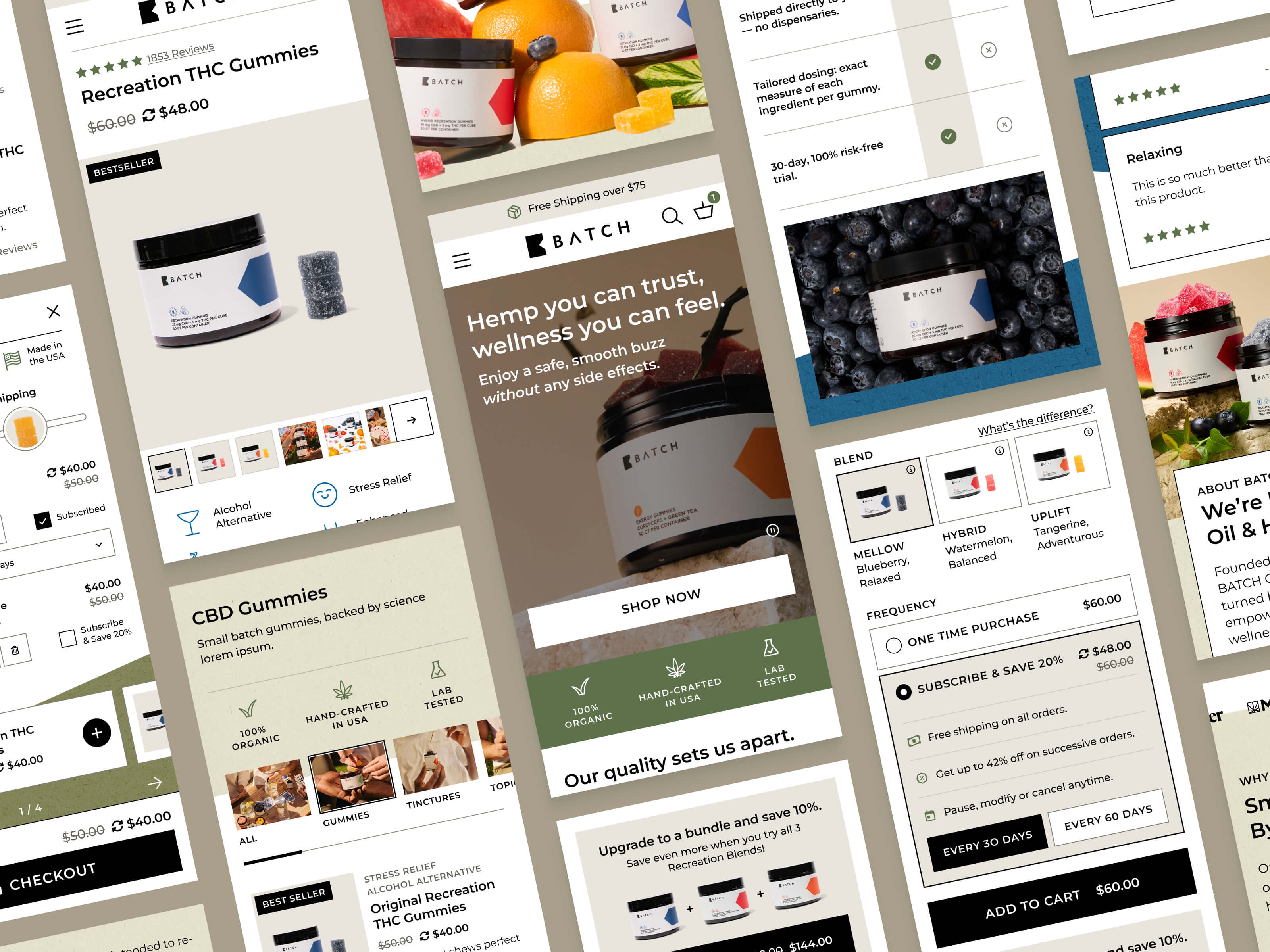
A collage of mobile screens showing the homepage, collection grid, and product page

Project Stats

  • client

    Batch
  • Type

    Ecommerce
  • role

    UX Design
    UI Design
    Accessibility
  • industry

    Food & Beverage
  • View Live Site

the challenge

A trusted brand that didn't look the part.

This Wisconsin-grown hemp brand was invested in high quality and transparent testing, but it’s pricing display and subscription opt-in was causing user distrust.Subscription was the default option, but the one-time price loaded on the page anyway. Users often added a product to cart directly from the collection, not realizing there was a subscription and one time purchase option. Rebuy’s cart design limits made it nearly impossible to tell customers they were signing up for a recurring order, not a single purchase.
The Approach

Solid design foundations, not just a fresh coat of paint.

Accessibility was a fundamental requirement after the client had been burned by bad page builder markup. So I started with the most atomic design system principles of type and color, to ensure we could build from a solid base.

I replaced a thin, narrow, and quite illegible accent typeface that was making CTAs hard to read, by using a single accessible brand font and varying weight and casing for visual hierarchy. Then I built a token-based color system with every pairing checked against WCAG 2.2. Both moves gave Batch the more elevated look they wanted while meeting the accessibility standard.

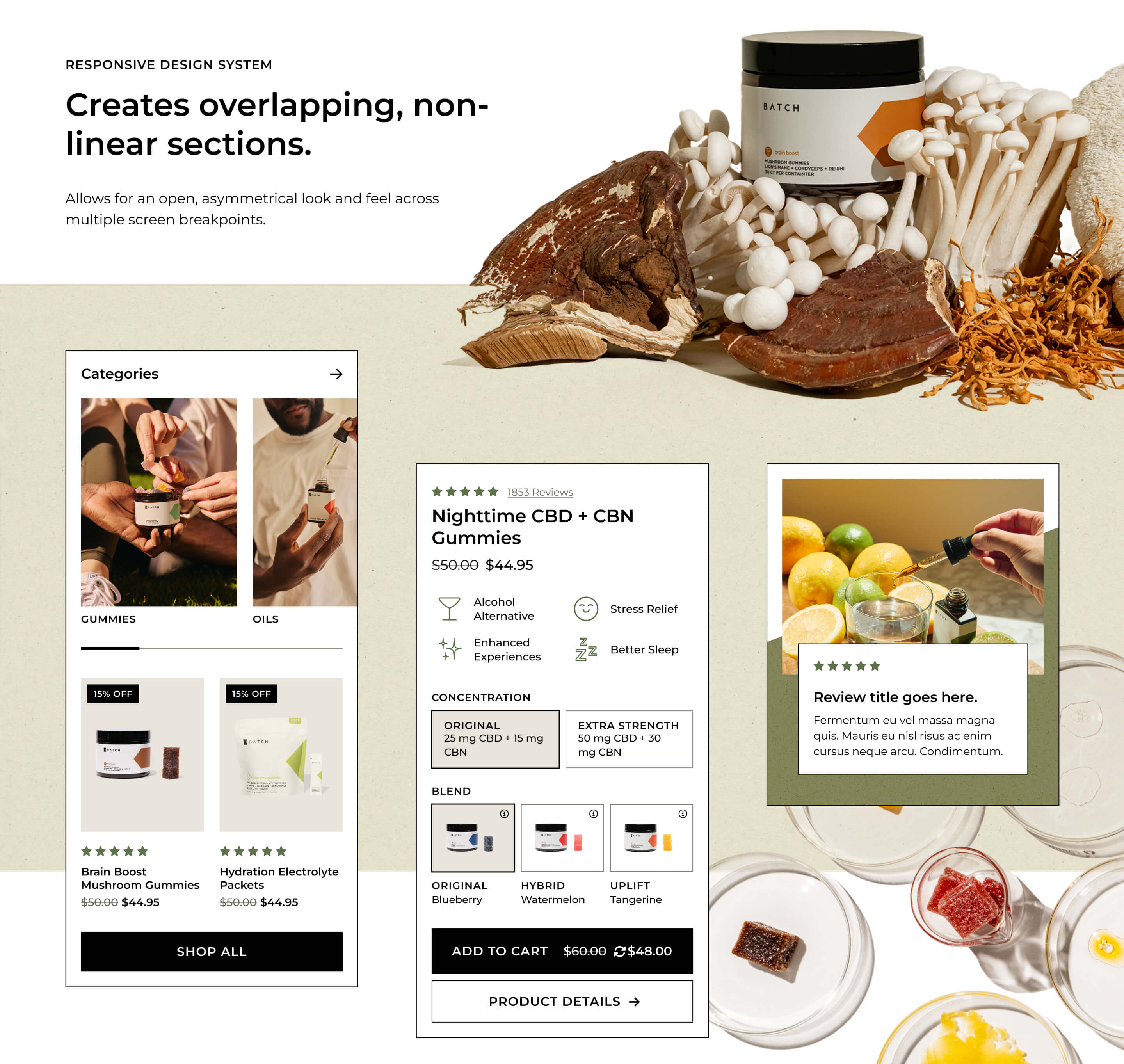
The rest of the design language pulls in their packaging texture, aiming for overlapping elements with a sense of depth. The art direction needed to bring life into a flat digital space by breaking out of boxes.

No items found.

Adding friction where it protects the customer.

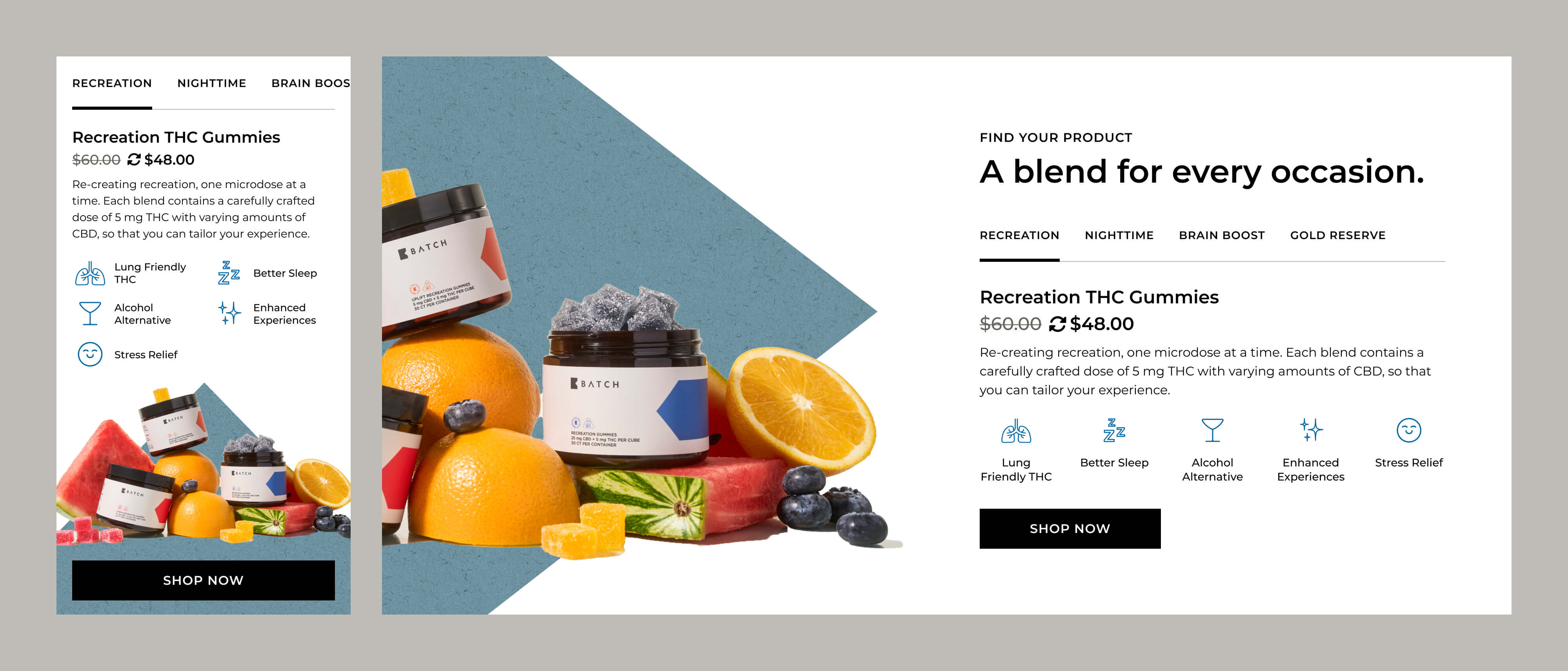
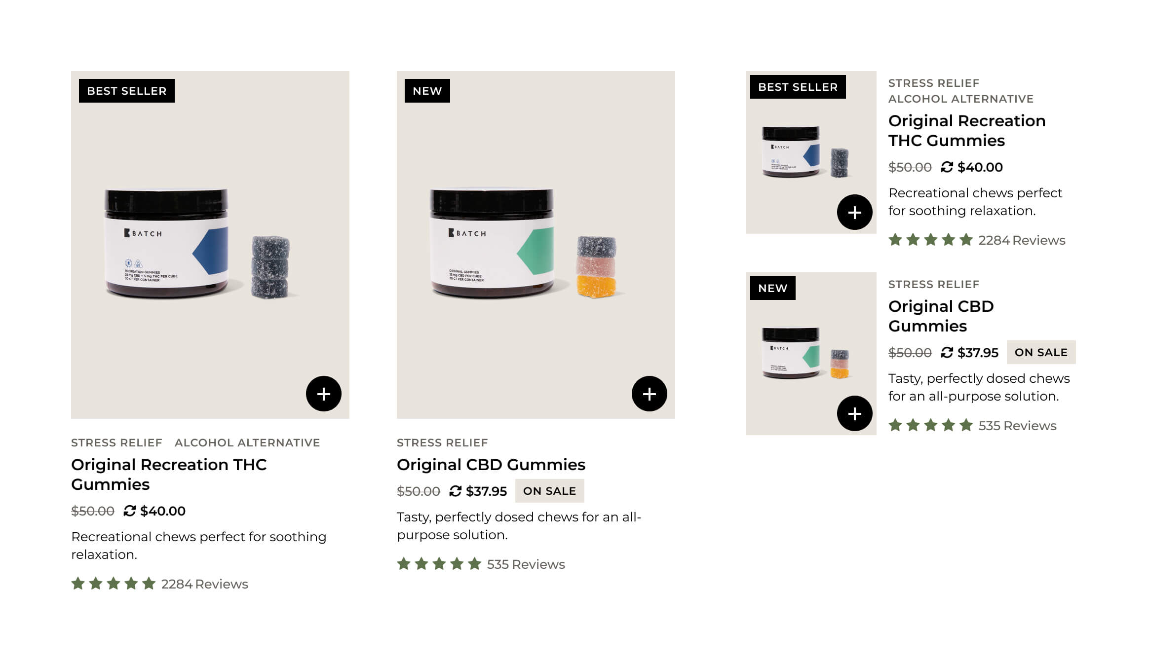
The original collection cards defaulted straight to subscription, cramming a full product form into the grid where the one-time-purchase option was buried and easy to miss.

We stripped the form down to a denser, cleaner card with a short benefits line, savings called out with a strikethrough price and a rotation icon for one-time vs. subscribe. A single Add to Cart button opens a quick-view instead of automatically adding a 30-day refill refill to the cart.

That small pause gives shoppers a clear opt-in moment, keeps the direct-add convenience the client wanted on the collection page, and cuts down the subscription-confusion tickets landing in support (or worse, in disputes).

No items found.

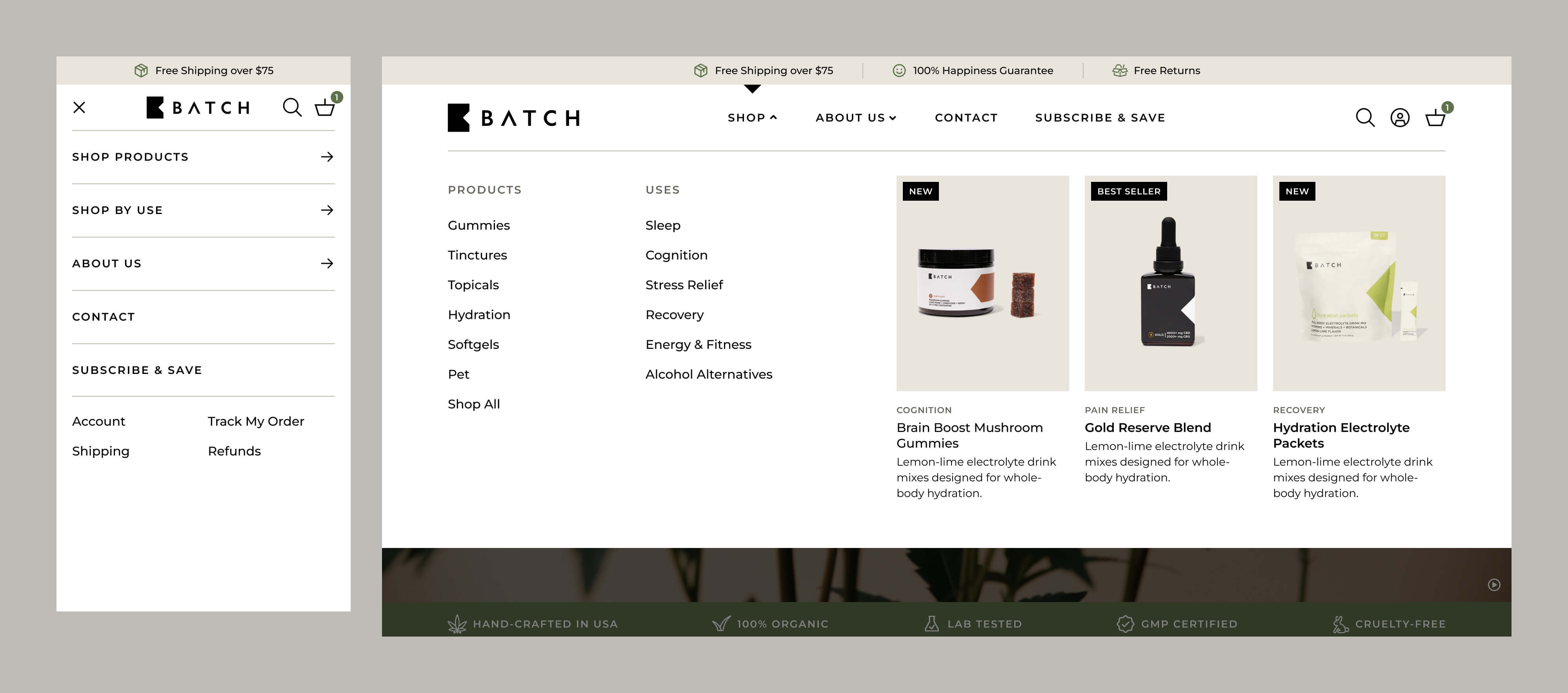
Splitting the shop menu by product and by need.

We split "Shop" into two paths: product type and benefit or use case, since shoppers arrive with different mental models. Some people, often returning customers, know exactly what product they want, while others know the problem they're trying to solve.

Giving both paths clear delineation in the main navigation cuts the number of clicks to a relevant product page and reduces the cognitive load since they aren’t guessing which category the product they need is under.

No items found.

The impact

Clearer paths, stronger funnel performance.

Three months post-launch, the redesign moved the metrics that mattered most: session value, conversion, and subscription growth.

  • Revenue per session
    +39%
  • Conversion rate
    +26%
  • Subscription sales
    +25%
No items found.