Elevating a Nordic superfood brand while growing revenue by 62%.

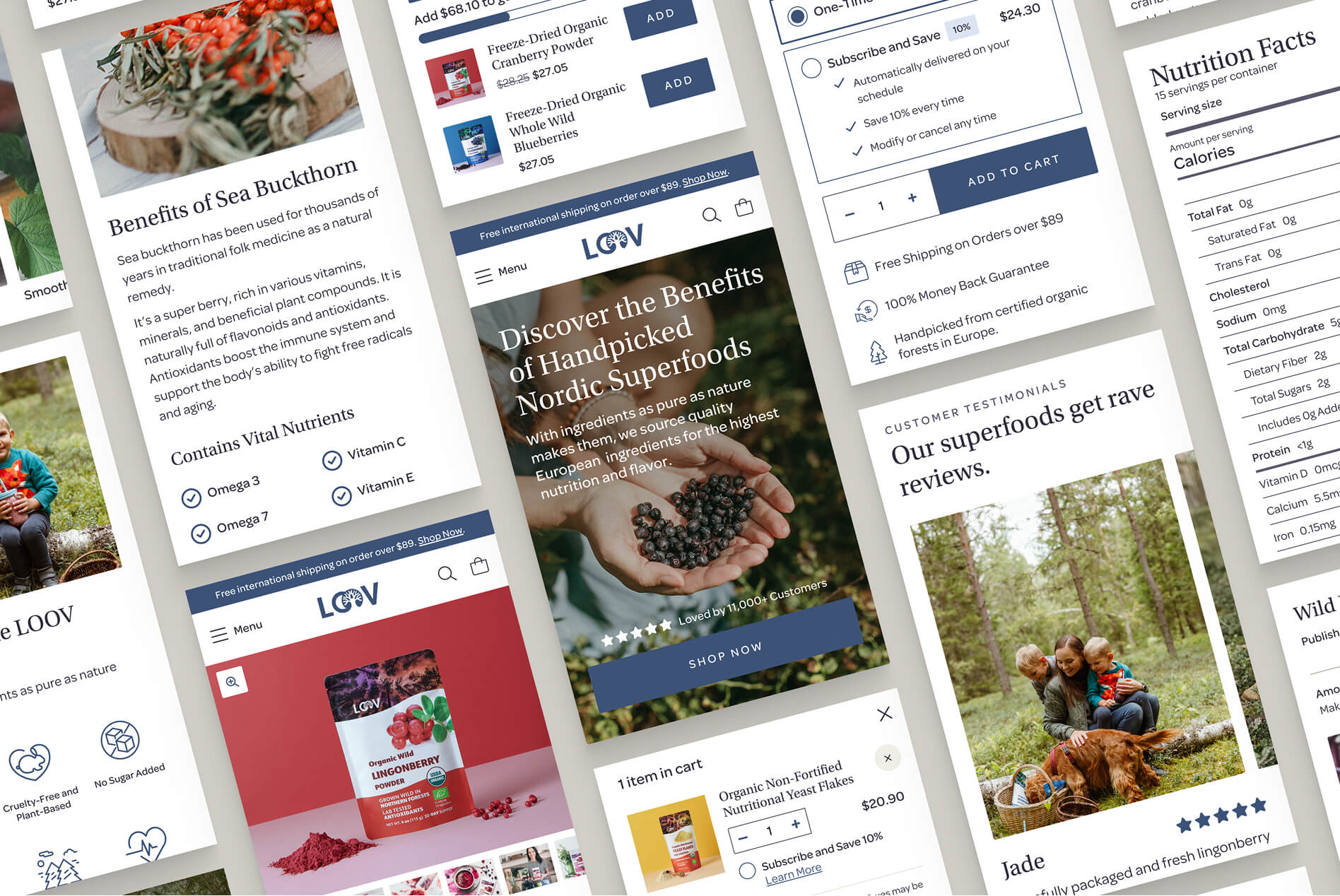
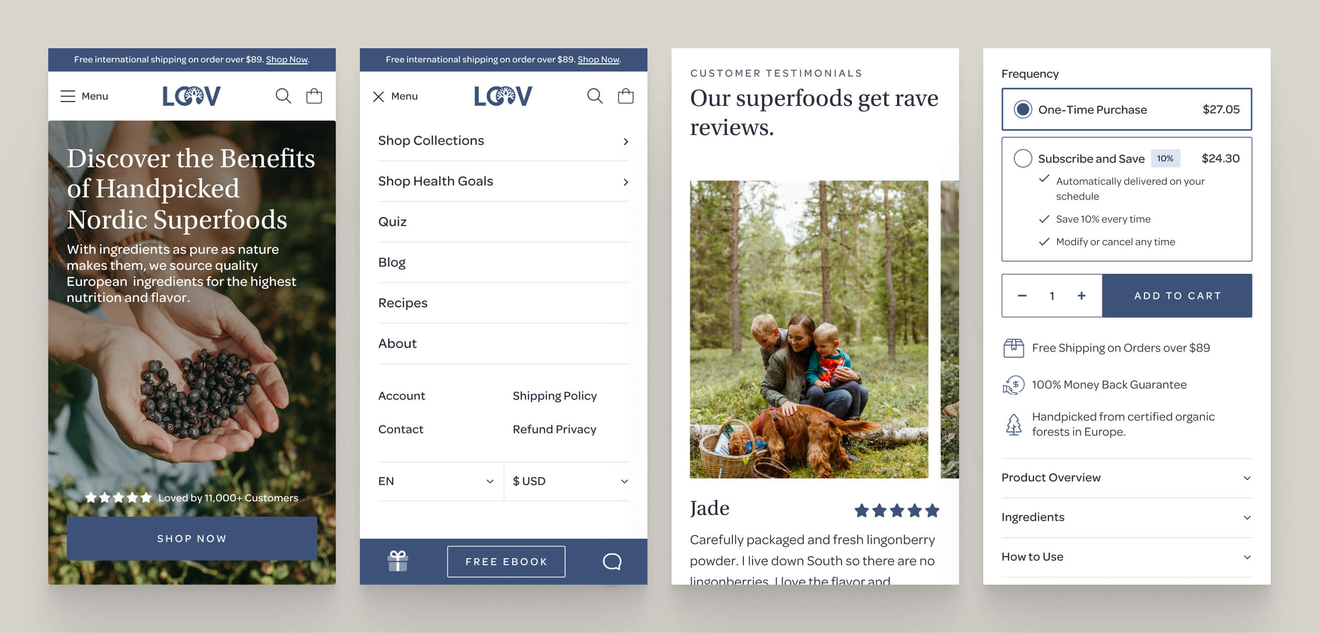
A collage of mobile screens showing the homepage, collection grid, and product page

Project Stats

  • client

    LOOV
  • Type

    Ecommerce
  • role

    UX Design
    UI Design
  • industry

    Food & Beverage
  • View Live Site

the challenge

A premium brand with a budget-looking site.

LOOV has been sourcing Nordic superfoods since 2008, but the site hadn't kept pace with the product. It looked dated, undermining the trust a premium, health-focused brand needs to earn. The brand guide was built for print and packaging, and its product-specific color coding didn't translate to a Shopify theme run by a small team.

The site also had a findability problem. Half of homepage visitors dropped off before reaching meaningful content, most product page visitors bailed after the main form, and users browsed the Shop All page without clicking into products. Long-form content like recipes and blog posts drove real traffic, but had no path back to commerce.
No items found.

The Approach

A color system built for the web, not print.

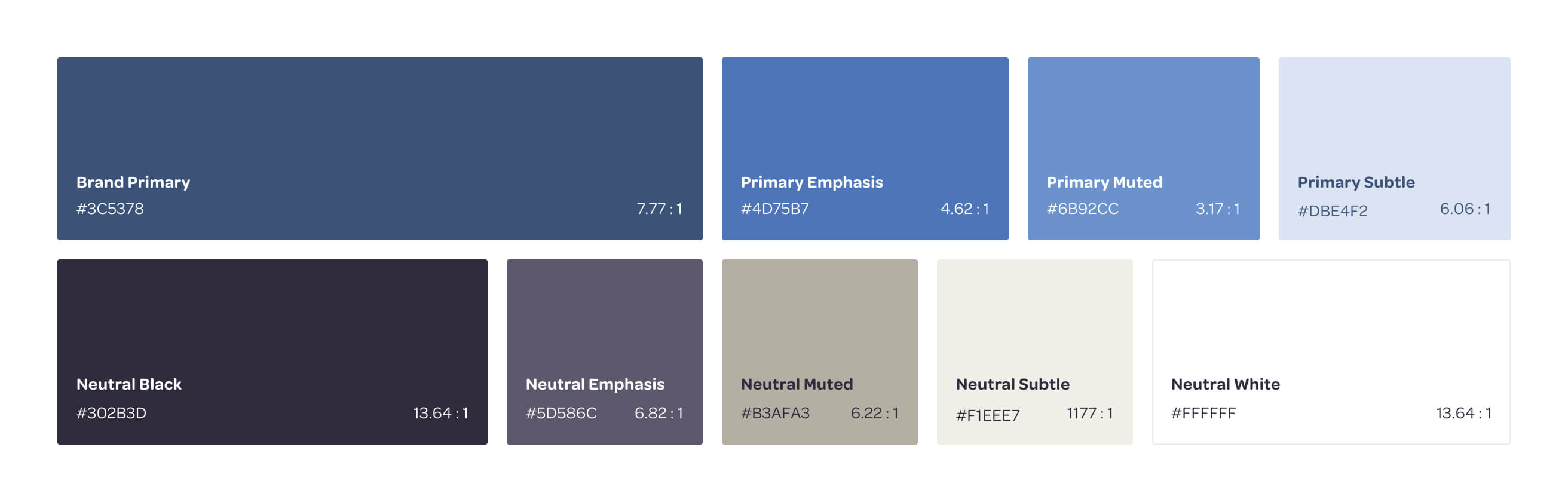
Translating it to digital meant building a proper semantic system: tonal ramps for accessible UI states, warmed-up neutrals that felt premium without going clinical, and a blue primary that conveyed the trust and depth their brand needed. It also needed to allow us to create a modern, premium, and airy look and feel for the interface.

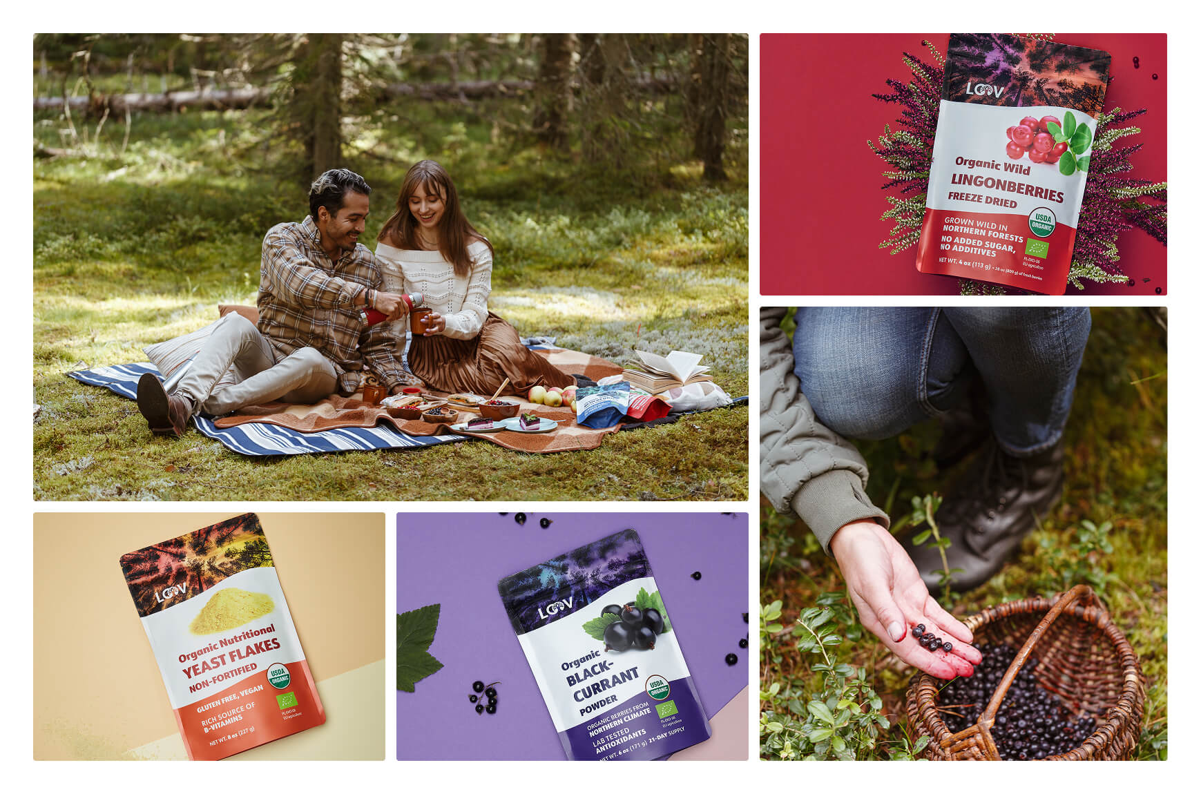
The goal throughout was a palette that felt cohesive and elevated across both their more chromatic product photography and the desaturated lifestyle shots they were moving toward.

No items found.

Connecting content to commerce.

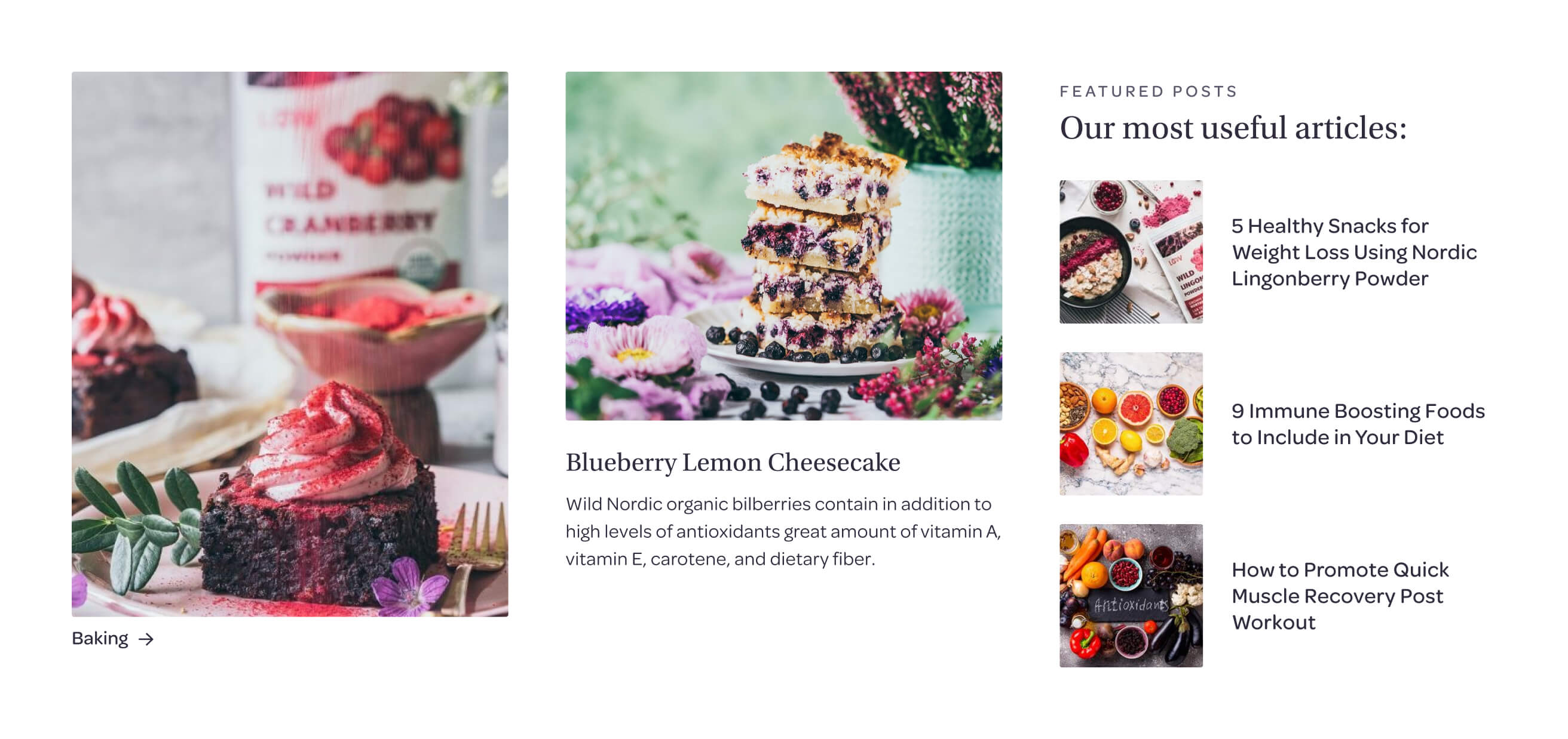
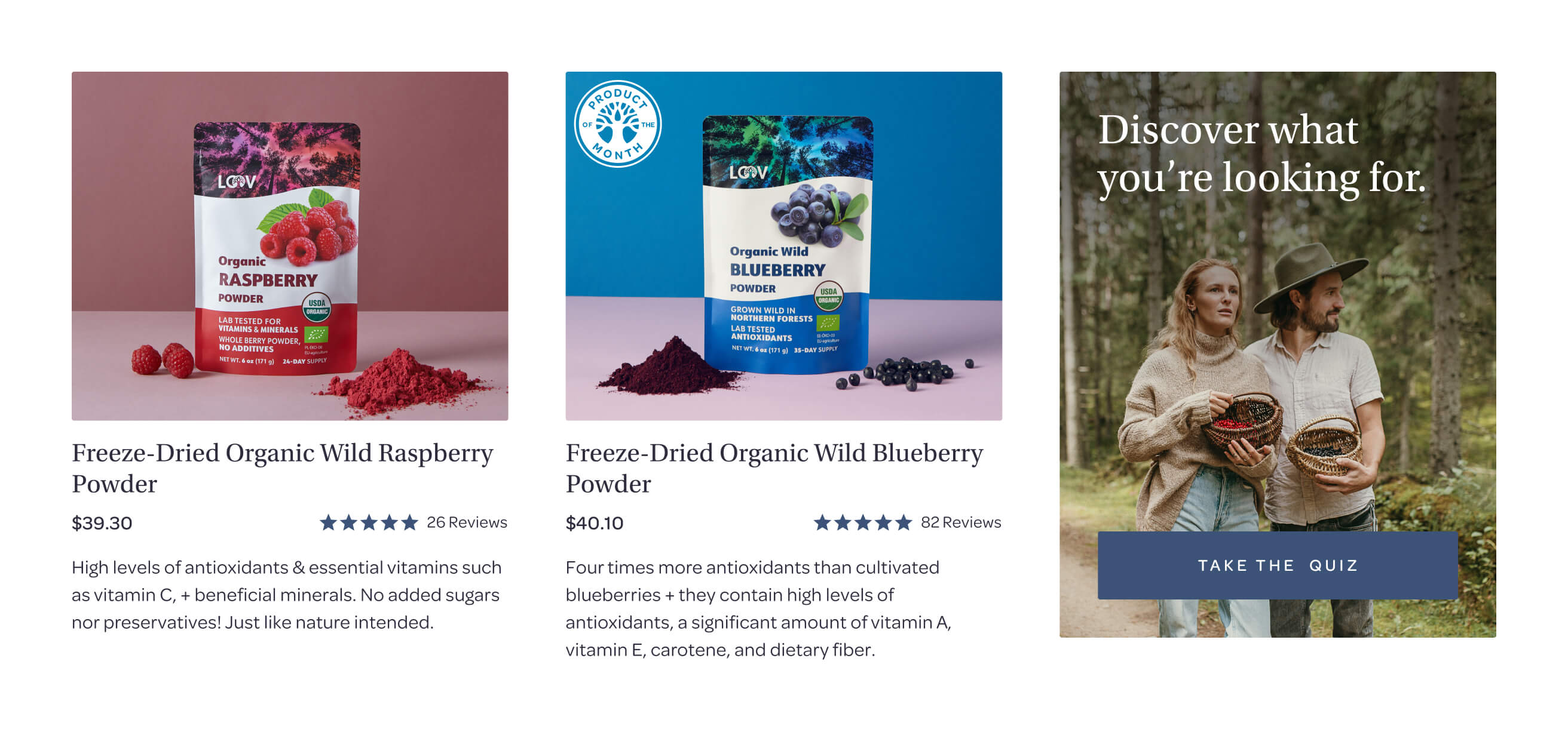
Blog and recipe pages got their own top-level nav items instead of being buried under a catch-all dropdown, and each post closes with a direct CTA to the relevant product. On product pages, related recipes and blog posts filtered to that ingredient appear near the bottom, so users who scroll that far land somewhere instead of hitting a dead end. Collection pages got inline content blocks, reviews, brand values, a quiz entry point, so traffic landing there first still gets brand context.

No items found.

Restructuring product pages around how people decide.

The drop-off after the main form came down to architecture. Product details moved into accordions so users could skim to what mattered. Subscription savings surfaced as progressive disclosure instead of fine print, and a bundle upsell sat directly below the form with savings spelled out. A sticky add-to-cart bar kept the form easy to access as users scrolled.

Nutrition information moved out of the product gallery, where it was invisible to screen readers, into an HTML table opening from the ingredients accordion, making it accessible by default and easier to read for everyone.

The impact

Better content architecture, bigger revenue.

Strong organic traffic was already there; giving it somewhere to go made the difference. Clear UX and a systematic approach to color and interaction gave the brand the visual credibility to match its products.

  • Revenue
    +62%
  • Average order value
    +5%
  • Total sales from new subscriptions
    +12%
No items found.